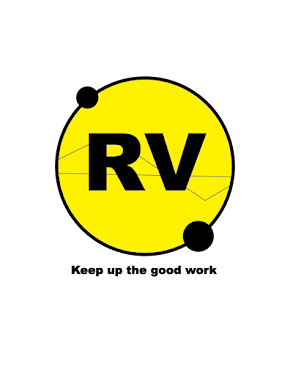
MONOGRAMS
Monograms are a unified symbol of letters. The letters are arranged to complement each other in interesting ways. When I decided to approach my work, I understood that when it comes to design, it is crucial to develop a relationship with composition. I had to arrange the elements of my "R" & "V" so that however I individually manipulated them I would need to balance them out. I tried examples where there was a clear hierarchy in the elements and symmetry.
ex 1 on Hierarchy:


ex 3 on Visual Business:

I am becoming comfortable trying out the many options for manipulation Adobe Illustrator has to offer. It feels like trial and error, where what I learn is useful to develop for later projects, even if they do not yet work now. The attitude I have towards art is that the more I produce, the more I understand why I enjoy some ideas more than others. Some are difficult to work at, so when I get as close as possible or even meet my goal I am proud.


Comments
Post a Comment