Posts

VC 116 FINAL CLASS BLOG POST

Image
     The goal of this Marketing Presentation and Ad project was to understand the process behind designing ads with strategic emphasis. I had to look into the Sakura arts company in order to understand more about their philosophy as well as who they intended to target. I learned that while they are primarily known for their art supplies their pens are also desired by corporate individuals for the waterproof black pigment ink.       With that said I started to move into the more difficult part of design which was how I might incorporate research into drafts. I had to think about how to space out areas for creation. This became difficult. I would move to execute by including my media, but I felt a lot of trouble with targeting a corporate demographic. I drafted about 3 versions for corporate, and I struggled with creating advertisements for artists. Overall I felt successful in learning now to take my work personally, rather to pay attention to whether I...
VC 116 MARKETING & DESIGN SPEAKER POST

Image
Today Jessica Sueiro talked to my class about marketing. I learned from her it is important to understand an audience through research. It increases the target efficiency of the design. She suggested it was helpful to develop an ideal of the buyer after doing the research. This helped make the relationship real. Research considerations include competitors, color theory, and the age, career, plus struggles of the ideal buyer. Jessica helped me understand that advertisement and design includes a lot of learning. There is a necessity to keeping up with the times to stay relevant, or otherwise it becomes easy to turn irrelevant. 

VC 115 PAGE SPREAD & INDESIGN POST

Image
When I started to work with a page spread, I decided to think about how much text I needed to fill the space properly. I created a 8.5"x 11" document with three columns to fit the text from an article I copied for educational purposes. These preset columns helped me to understand how I would layout the text by separating space for the elements, which included images as well. I believe InDesign is a useful program to put long documents together, such as magazines and books. It is primarily a packaging program so it is useful for sorting information into files that include the image links, typographic fonts, and a final PDF export. I love this aspect because as long as I keep my package together, I do not need clutter over my desktop. This helps me to be efficient.

VC 115 Blog Post Monogram & Apps Review Post

Image
The most difficult challenge designing the monogram was using the wrong software. I used Photoshop to create the logo in order to understand my limitations. Photoshop deals with raster images which means the work can not be scaled without losing resolution.  I understand that Illustrator is the best choice to create monograms. I can change the monogram for print ready use by changing the color mode. Lastly, a PDF is important to use because it sorts the artwork information into a portable document. 

What Is Advertising?

Image
Advertising has to do with catching the attention of a specific public to follow up with their content, messaging, or product. When it comes to designing an advertisement, it is crucial to research what is relevant to the interest of the public I want to appeal to. That means I have to consider age, common interests, and then how the product I am pushing will meet their needs.  Here is an example advertisement I have created to invite musicians to an open mic event where our featured artists were going to play:

VC 116 FIRST POST

Image
As of today, I am  an intermediate graphic designer. I am able to use the Adobe software for experimentation and academic submission purposes. However I am working towards the long term experience of an advanced master. For me, I plan to go into the book publishing industry where I will design book jackets and the interior layout of text. I have taken a lot of courses from how to use the basics of Illustrator, Photoshop, and InDesign. The higher up classes have focused more on layout, typography, graphics, and advertisement.  With respect to advertisement, I believe it is a way to capture the attention of a targeted market with the intention of persuading them to follow up. In this advertising course, my plan is to create content that specifically garners interest. I want my art to catch attention so I have examples of where it is commercially viable. I want to create work that is competitive for a book market. I want to serve clients by creating eye catching work. Here is an ...

VC 115 RETURN T BLOGGING

Image
As an artist, I am interested in book design. That means I want to develop the jacket exterior and page layout interior of books. Readers should expect to see designs related to packaging, flyers, illustrations, and so on. I think that blogging will help me keep a record as I progress in my art career. In terms of my Graphic Design experience, I am at an intermediate level now. I understand how to use the software but as I proceed in my upper-level advanced courses I am starting to understand the importance of art as it relates to communicating the purpose of an idea. Early classes taught me how to manipulate photos or create clip art whereas now I am learning layout organization principles, for example. I hope that this class helps me to grow a stronger understanding of layout.

Final Package Document and Poster Post

Image
  In this last blog post, reflect on the final project. 1. What was the project about? Detail the different parts of the project. 2. Were you able to apply the Gestalt Principles of Design and use them to guide your creative decisions? 3. What was the most challenging part of the project?   4. Drop in a final screenshot of the Poster here? 1. This project was about creating a style guide for The International Print Museum. That means I had to develop a gathering of sources to organize in a package that represented the company. These sources included the logo, logo variations, logo icon variations, fonts, and color swatches for CMYK, RGB, and Pantone, and finally creative possibilities for the logo to be used on shirts or on posters. I had to use a pre-stylized package in order to sort my sources with precision. Anytime I found a mistake it was due to the pre-flight feature in InDesign to point out any break in the style, for either text, characters, or their color.  ...

Working with Pantones Post

Image
I have learned that working with Pantone colors can be a lot of fun. To be clear, Pantone colors are print ready pure colors. They are best saved as an EPS. or Pdf. I used Photoshop in order to darken the shades with a cool blue, and approach the highlights with a unique orange. At the end of adjusting my image, I decided to covert my color my from duotone to CMYK. 

Logo Touch Up

Image
In order to retouch a poor low resolution logo, I had to improve the quality the best I could before i could prepare it for vector. I used Photoshop to manipulate the image resolution and then I altered the levels of the altered image to be close to black. When I exported my work as a png to Illustrator, I made sure to use image trace in the windows tab to vectorize the image. At this point, I created several artboards to manipulate several copies with color or without color. I lastly made sure that my product was exported as a png.

Elements and Principles of Design

Image
When I approach designs, I make sure to sketch out the layout so I have a rough idea of approach before I use the computer. This allows me to construct space for my elements and strategize how they plan to interact through principles.  Here are a couple of drawings I made for WORD magazine and the final layout:

VC 112 Digital PrePress

Image
The new year has helped me realize I am further along my graphic design career than where I started. Initially the software was elusive. Now I am at a point where I can problem solve using the software myself. As an artist, I am learning to create a variety of art to find my strengths. I know I want to work in book publishing with an emphasis on book exterior and interior layout. I think blogging is a great way to express where I am. I know that I am further along than where I started because I have reference points. My instagram is @polymath81 😄 Here are a couple art pieces!

Pantone Project

Image
1. Pantone colors cover a lot of the image. They change the darks and the highlights, so it makes sense to choose wisely colors that can contrast each other well. Pantones are crucial to know about, but because it is more expensive in practice, CYMK is going to be preferred for print. CYMK allows a variety of print colors for less, while Pantones are best to choose from one to two colors. 2. The process of working with Pantones over CMYK is restricting. Understandably, there are fewer options available. CYMK colors must be translated to convert into Pantone for more diversity. The printing process is easier to use with fewer Pantone colors. The printed final product is deeply rich with those fewer colors. With CMYK, a viewer can look into the mixes between Cyan, Magenta, Yellow, and Black to see the different colors.  3. The most difficult part of this project was trying to create a mood using two colors. I did not want to create a piece with random colors so I chose blue and green...

Photo Retouching

Image
  How did you meet the objectives of this project? Do you feel you were successful? Write about your creative process in manipulating the image? This assignment was difficult in that there were many steps. The benefit of following directions is that it leads to a fuller understanding of a narrow process. I did my best to follow the steps. I practiced using the clone stamp tool and the patch to get rid of the tears and bends within the photo. I could not spend all my time too focused on each step. I had to keep moving fast or risk my perfectionism taking control. I got frustrated a few times but I rested in between. For that reason, I feel confident.  The creative process is one where mistakes are allowed to happen. I have to learn how to work around them. I realize that not every viewer is able to tell what else needs work on. For me, the paintbrush was upsetting to use. Each time I used it, if I let go of my click, I would have to click again for the targeted selection. Howev...

Campaign Ad Post

Image
This is the final project for VC 129, Photoshop. I used color range to target the suit of the model. The original suit was red with a gray background. It has a strong presence given that red is a hot color, and so it demonstrates energy.  I removed the red color with color range to use a gray suit with a purple background. For me, the idea was to use purple as a cool color for the symbolism of royalty. I used white type and used my black logo as a way to complement the darker grays and shady tones. Overall, this creates a coherent color scheme with purple being used as a unique highlight. I believe that the message 'UPGRADE WITH CLASS' fits well with the composition. This is because the logo is stylistic and imitates elegant type with a bold 'V' to contrast the curly 'R.' The color here acts as a way for the light to stand as a backlight against the body of the subject, to the viewer. I feel that I was successful with the final composition pulling off the messag...

FINAL CLASS PROJECT

Image
 I designed a mailer for Hank Willis Thomas as if I was working as a Designer for MOCA. I had to include information that was crucial, so I used the title of the virtual exhibit. Then I used provided text for the body information until I finished it off with a social media portion. Overall, the purpose was to invite the general public with clear guidance. I felt this was sufficient. I began to work on the back side which was a simple imitation with fewer parts of the front. I did not touch the furthest right side from the center trim. This side is called an "indicia" and it is where mailers are able to print to the address of its mail recipients. I feel that after several reiterations I was able to find some consistency with a theme that complemented both Hank Willis Thomas and the design representation for MOCA. I know that I finished as strong as I could, however, there are lingering doubts about what else I could have done. As a designer, my attention is embedded deeply in...

Designing With Type and Hiearchy

Image
Design depends on communication. Delivery is crucial. For this reason, a designer must structure their work with a format that creates paths for a viewer to understand. So this means there are titles, body sections, and other details such as contact information to consider. I have not thought about designing without an image before. Each time I think about page layout, for example, my sense is to gather all my supplies from type, images, and a mood board. Using black and white text forces me to think simply. I still have a lot of room to grow by trying out more complex ideas. The objective of this flyer exercise was to use a variety of point sizes and weights with the same font across three pages. I feel that I accomplished my task the third time for a more final finish. The first and second submissions were cleaned up to draw visual weights near the areas that introduced important information. I made sure there was a strong sense of alignment to repeat the theme the information was ti...

MONOGRAMS

Image
Monograms are a unified symbol of letters. The letters are arranged to complement each other in interesting ways. When I decided to approach my work, I understood that when it comes to design, it is crucial to develop a relationship with composition. I had to arrange the elements of my "R" & "V" so that however I individually manipulated them I would need to balance them out. I tried examples where there was a clear hierarchy in the elements and symmetry.  ex 1 on Hierarchy: ex 2 on Symmetry:  A lot of the challenges involved in design deal with letting go of a design that is not doing that well. I had to create nine unique variations of design with these letters. I wanted them all to work so I tried experimenting as much as I could. This naturally meant that some were more vibrant and visually busy.  ex 3 on Visual Business: I am becoming comfortable trying out the many options for manipulation Adobe Illustrator has to offer. It feels like trial and error, wher...

PHOTOGRAPHY & DIGITAL ART.

Image
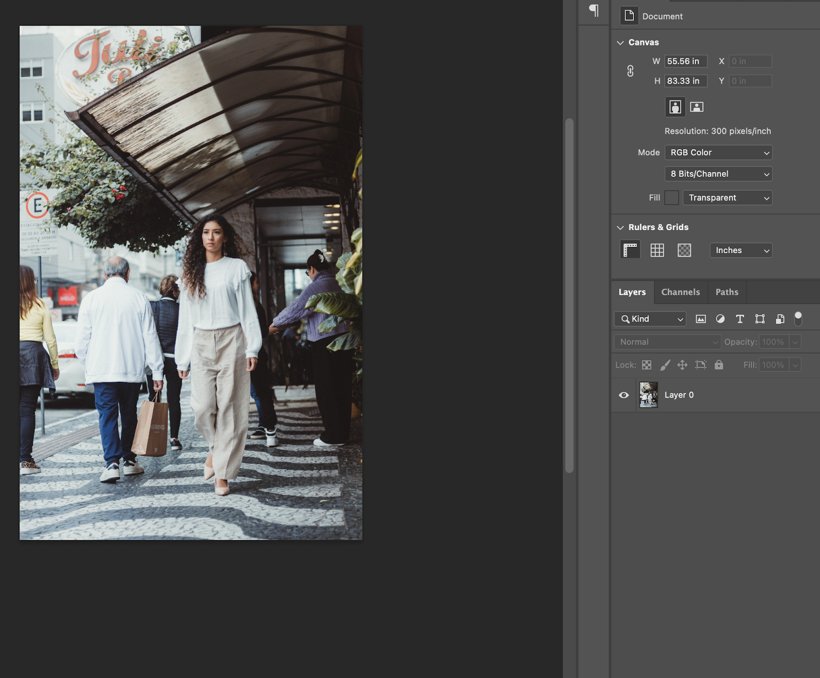
I recommend early graphic design artists upload for free their early work to stock photo websites of higher quality, like here https://www.pexels.com/. It tests your ability to share your work regularly and in larger quality to compete for attention. It helps you meet other designers with a different style to ask deeper questions.  Compare software, like Canva and Adobe products. Canva's text boxes can not be regulated to proportion management of type. Adobe allows for larger fonts, points (think of a pen tapping a paper), fills & strokes. At the same time you can use more AI power tools of repetitive menial technique needs like hatching. Or look at user experience and user interface. LEARN, LEARN, LEARN. Do not fear AIs. You can turn a computer off without it feeling like killing a person. Tools in art submit to our competence in stern decision making.  Here's a photo I'm proud of:

Color and Application

Image
     I decided to approach my cutout with a flower in the foreground to clip the building behind it. Flowers are enjoyable to look at. When they are set as a clipping mask, the flower introduces elegance over the interesting architecture. The design is meant to share a message that the place to visit is not fully known, and it can only be uncovered by actually checking the location out.      I love the burgundy color of the red flower-clipping mask. To me, it matches the intention of a classy greeting card. The warm color encourages the recipient to visit. Yet the burgundy shade is not so vibrant that it is unsettling. I made it match the frames of the architectural windows to create color repetition. The consistency allows a thematic integration of the parts to harmonize without unnecessary color clashing.  I ultimately feel that the product's use of burgundy goes very well with the greeting card. The building behind the flower frame has strong yellow...